Friday, 2 September 2011

Secondary Research


The following is some second research into some brands of fizzy drinks and research into similar markets to my product.

Product 1 - Coca Cola (Time magazine 1950):


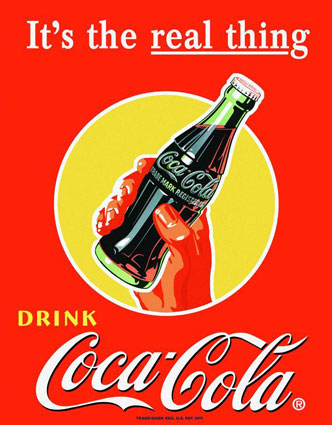
The target audience for the above advert would have been of a wide range. There is nothing specific in the poster to appeal to any age group so I would say from teenagers up to mid 40 year olds. The social backgrounds also range wide as the product is cheap enough for most people to afford. The poster has used a form of ‘bandwagon’ advertising where they use an element of propaganda by stating “drink Coca Cola” and “it’s the real thing”. This makes people think it is the right product to drink and that everyone else must do so too. Even though I have mentioned that the age range for this poster is wide, I would say that the younger consumer is targeted more with the bold colours screaming to get their attention.

One thing I noticed about the colours was the psychology behind them. For instance, most of the text is in white which people usually associate with purity and therefore the truth when the brand says “it’s the real thing”. The main colour to the poster is red which is used when you want to draw attention as it is often where the eye looks first. The last main colour being yellow which is the colour of the sun, associated with laughter, happiness and good times. The Coca Cola logo it’s self is interesting as it is an unusual font and therefore draws you’re attention to the advertisement.

Product 2 - Dr. Pepper (Newspaper November/December 1958):


The target audience for this poster is mainly children up to young adults. The specific reasoning for this being that the Christmas design appeals more to a younger audience who celebrate that time of year more so than an older consumer. Also the poster shows a young girl which allows that age group to feel associated with the design. Social backgrounds for this aren’t as such limited, but only for those who celebrate the Christmas holiday. The producers of this poster have tried to sum good feelings and experiences with the expressions on both the girl and snowman’s face which suggest by buying their product you can be just as happy. The advertising techniques for this poster are a mix of emotional selling points and bandwagon.

It has the emotional selling point approach by letting people make personal connections to Christmas memories. For the bandwagon approach, the poster states “drink Dr. Pepper” which like the above Coca Cola poster makes you feel like this is the product to drink. The logo for Dr. Pepper is very similar to Coca Cola’s in that it is an unusual font and sticks out. Another point could be that both Coca Cola and Dr. Pepper are similar products so the logo may suggest ‘we’re just as good/similar product’. The psychology behind the colours used has an unsurprising effect. Red catches your attention and the white suggests purity and safety. The yellow of the gloves and clothing gives the happiness effect. The hat of the snowman and hair of the girl are black which suggests authority, power and intelligence (smart thinking for buying this product). Blue is an interesting colour as it causes the body to produce chemicals that are calming. Again, the lighter green has the same calming effect.

Product 3 – Fanta (web):


The target audience for the above Fanta campaign would be teenagers to young adults. The main reason behind this is the colours which appeal to younger eyes and grab attention while also have a younger audiences design. Social backgrounds for the product are open to all as nothing excludes anyone. The producers of this advert have obviously tried to get people on board with a fun approach to the design with lively and surreal settings. The advertising techniques for this poster are mainly unique selling points. This unusual design for the poster hasn’t been done before or on the current market of advertising which makes it unique.

The Fanta logo follows the campaigns style of being fun and almost drawing on 60s groovy fonts. The logo is always within an orange to give the consumer the brands flavour. The psychology behind the colours used has an interesting effect. The main colour used is of course orange. Orange is the most flamboyant colour which is associated with fun times, happy and energetic days, warmth and organic products. There is quite a bit of white used which is associated with purity, cleanliness and the safety of bright light. The logo itself is navy blue which represents steadfastness, dependability, wisdom and loyalty. The lips of the mouth are purple that is associated with wealth, prosperity and rich sophistication.

Product 4 – Lilt (TV):


The target audience for the above lilt video would be teenagers to middle aged adults. The colours are bright which appeal to younger eyes but also to older watchers who are familiar with relaxing destinations like the one shown. Social backgrounds for the product are open to all which also features a Jamaican voice to back this up. The producers of this advert have obviously tried to get people on board with an amusing approach to the fun and surreal idea. The advertising techniques for this poster are mainly wit and humour. Animals in adverts usually please the viewer very well as there is an element of humour especially in this case.

The lilt logo follows the campaigns style of being fun as well as looking exotic just like the adverts location. The psychology behind the colours used has an interesting effect. The main colour is the red of the parrot. Red is used when you want to draw attention as it is often where the eye looks first. Blue is also present which makes the consumer calm down which is also the effect of being at an exotic location. The logo itself is green like growth, nature, and money. It’s also a calming colour that's very pleasing to the senses. The pineapples are yellow which is the colour of the sun, associated with laughter, happiness and good times.

Research 5 – (Book/report):

After doing some research, I found out some helpful information for when I come to create an advert idea. Soft drinks have helped the economic downturn in some ways by being a cheap treat for consumers. Although this means a product must be sold in mass volumes in order to make a profit. 38% of drinkers buy from outdoor placed vending machines with 87% who buy drinks for use at home. In the UK an estimated 40 million people drink soft drinks of which are aged 15+. Products with low sugar and no sugar have shown considerably higher demand with 45% of drinkers more likely to consider switching to a low calorie option than last year. 16-24 year olds are proven to like a variety of flavours where there are opportunities to explore that field as other brands are not so brave with fear of losing money. Higher brands have higher prices as consumers feel they can trust the company.

Primary Research - 1

The following is analysing two adverts aimed at different audiences:


Coca-Cola analysis:

            In this analysis, I will go through in detail as to how and why the components were used in the promotional video for the classic Christmas coca cola advert. This and another advert analysis will help me towards developing ideas for my own advert.
            The advert was filmed in the late 90s and has become a cult classic for the Christmas season. The storyline of the advert is quite simple but with a massive effect. The following is a small synopsis of the advert: The ad shows a long line of trucks travelling through the night on their way to deliver coca cola to stores. Throughout the advert, characters are seen emerging from the side of the road in marvel of the trucks. The characters themselves are silent and are merely there to show happy emotions. Father Christmas is also featured animated on the sides or rear of the trucks which gives away the theme. In all, the advert is very conceptual in that it would be very unlikely to see those many trucks in one place as well as the Santa element. Also landmarks from all over the world are seen in one place to represent coca cola being a worldwide phenomenon.
            The representation of the advert is clearly aimed at families as that is the top target market for the Christmas season. These characters being; brother and sister followed by 2 fathers and their sons in cars. What I found odd about this advert was that although there were 2 fathers, there were no adult women to fill the role of a mother. The main point of showing these people are to capture the happy emotions that are usually associated with Christmas. This makes the audience want to experience the same emotions and therefore buy the product. This target audience as mentioned above is for families who celebrate the Christian holiday (which is a huge market as the holiday is celebrated all over the world). This idea work as the feel of the advert is to deliver happiness and make you feel as if you are good enough to enjoy their product.
            The brands image/logo is seen regularly in the advert on the trucks in bright lights to make a big statement about the company. For the editing of the video, the cuts go slow in a similar speed to that of the music used. In fact the only sound that can be heard is the background song with the Christmas theme of the lyrics being “Holidays are coming” etc. The camera shots used try to just capture the emotion in most shows such as 2S’s for the characters. WS/LS’s are used for the trucks and background images such as the light up bridge and landmarks from all over the world. The mise-en-scene of the advert is quite interesting. As mentioned before landmarks from all over the world are present which gives a sense of unification. As the trucks pass by the brother and sister, near by Christmas trees light up one by one as if magically turned on by the trucks. The same happens to a bridge that they cross and this all gives a feeling that coca cola is the right choice. The intertextuality for this ad is simply Christmas although the ‘Home Alone’ movies have the same Christmas 90s feeling which may have influenced its creation.
            I think the ideology of this advert is that coca cola is the unofficial official Christmas soft drink. I think this is proven by how the ad is shown every year in the UK and has had wide acclaim. The genre is a mix of holiday/fantasy/family which is the three main ingredients for a Christmas advert. I think the ad in all is very successful as it is rare for an advert to be used for over ten years and the selling tactic (emotional selling points) draw in the audience to experience a truly unique journey.

Dr. Pepper analysis:

            In this analysis, I will go through in detail as to how and why the components were used in the promotional video for a funny Dr. Pepper advert. This and another advert analysis will help me towards developing ideas for my own advert.
            The advert was filmed in the late 90s and is perhaps one of the lesser known adverts from the brands collection. This could be that the length of the ad would cost a lot more to show here than in the states and a shortened version might not make as much sense. The storyline of the advert is quite simple with the camera following a couple’s every day life. The following is a short synopsis of the advert: The ad shows a man who is the main character of which is in love with two things. His girlfriend and Dr. Pepper. The scenes test his love for the girlfriend by doing things for her that most men would feel uncomfortable doing. As she reaches to share his Dr. Pepper, he jumps up in fury and runs out suggesting the product is too good for her. So I think it is fair to say the genre of this ad is simply humour.
            The background characters are silent and are merely there to create real and awkward situations. Other males within the advert are represented as being typical males who would not do what our main character does. The background characters have been represented this way because it creates humour to the watcher. For example the owner of the store who out loud announces that a man is buying tampons is funny as it is against what the majority of males would do and it’s an awkward moment. The deliverance of humour in this advert for me comes from the reactions. In all, the advert is quite conceptual in that the greater chance is someone would not walk out on their lover for wanting to take a taste of their drink.
            The target audience for this advert I would say is teenagers to young adults (16-28) due to the humour used as well as people in that age range understanding the awkwardness of the content. Also the age of the main characters in the ad are similar to the above estimated audience. Unlike the coca cola ad, this video has no background exclusions (e.g. religion) as it only targets love that can be shared by anyone. The advert would have been successful because as mentioned there are no exclusions as well as the subject creating an entertaining video which is more than most adverts which try to just spell out ‘buy me’.
            The brands image/logo is seen regularly in the advert as the main character constantly has a Dr. Pepper drink as well as the logo and example of the product at the end. For the editing of the video, the cuts go slow in a similar speed to that of the music used. This is very similar to the coca cola ad as the only sound that can be heard is the background song which is Meat Loaf’s ‘I would do anything for love (but I won’t do that)’ which again relates to the subject and adds more humour to the conclusion. The camera shots used range from 2S/MCU/WS with some moving shots and crane shots that all show the couples emotion as well as adding a movie touch. The mise-en-scene of the advert has been mentioned above as adding wit. Something I noticed was that as the background music sparks into life, the choice has been made that Dr. Pepper wins the main characters love. This to me seems like the company’s ideology is saying ‘this is the right choice for you to make while shopping’ as well as claiming you’ll choose their product over your lover. The intertextuality could be from films like ‘American Pie’ where young adults have amusing love related themes and situations.
            I think the ad in all is successful as anything that can make you laugh makes you think about the message. The selling tactic (wit and humour) draw in the audience’s attention which is key for any company that wants to make money. One thing that lets it down compared to the coca cola ad is that it won’t be remembered as much.

Primary Research - 2

The following is some research I done in to the market I'm advertising for in the form of a questionnaire and 3 interviews:


 Questionnaire (voted by 5 people):

1. What genre of advert do you prefer?

  • Comedy: 6
  • Drama: 2
  • Family: 2

2. Do you think good adverts make you want to buy the product?

  • Yes: 2
  • No: 4
  • Depends how good: 4

3. Would you prefer a lighter or darker looking advert?

  • Lighter: 8
  • Darker: 2

4. Which persuasive techniques do you prefer?

  • Sales and Offers: 4
  • Persuasive Language: 2
  • Celebrity Endorsement: 4

5. Are you interested in promotional discounts for events?

  • Yes: 4
  • No: 2
  • Depends: 4

6. Do you prefer original flavours or old (e.g. Strawberry, Chocolate etc)?

  • Original: 6
  • Old: 4

Interviews:


Interview 1, Alan: “In adverts I like something that keeps my attention until the ad finishes. Most of the time its funny adverts that help me do this and I think it helps the message ponder the mind. An example that springs to mind are those Dr. Pepper adverts or the Cravendale Milk ad with the cats. When it comes to an advert making me buy the product, it would need some suggestive dialogue to make my taste buds burst.”

Interview 2, Niklas: “I don’t really find that an advert makes me buy a product. I go by what I know I like. If a new product is released I may be persuaded by the use of language or how the advert uses clever techniques.”

Interview 3, Joe: “Humour is important for me. If every ad on TV was at least amusing, advert breaks wouldn’t seem so boring or long. Unique adverts also impress me.”

Developing Advert Campaign


The Aim:

Below are my plans for a new fizzy drink product with a target market of boys aged 14-18. The product will be called Komet Ride with a space theme to the brand as well as advertising campaigns. The video advert will consist of a very cheap sci-fi style setting along with very cheap props to make an amusing space themed ad that will appear to the targeted audience. This is all because my research shows that people respond well to funny adverts.

Brand:
The following is a can design for my product 'Komet Ride'. It contains all information and will fit perfect on to a drinks can.


Target Audience profile:

The following is a profile of an imaginary consumer:

Name: Rodger Flumpty

Sex: Male

Age: 18

Hobbies: Music, Guitar, Saving the world.

Why he drinks Komet Ride: “It powers me up when I need to save the Earth and beyond. Oh, and I look like a bundle of loveliness.”

Synopsis/Treatment:

Synopsis:

My brand name is ‘Komet Ride’ which as you may guess takes on a space theme. For this I will have some kind of geeky male playing the role (within the ad) as some kind of space hero. His role will be to protect a female character from an alien in the background. Amongst a badly written script, the serious/cheesy acting should all push towards an amusing advert for my market.

Treatment:

Setting:
September 2011.
A field.
At least 3 characters.
Day.

The advert would begin with a shot of an unimpressive and non scary alien with stereotypical 50s horror music for around two seconds. Here we then see our male hero standing proud with a female looking scared. The hero will be holding some kind of cheap looking ray gun while the female clings on to his jacket. At this point the alien would be slowly approaching them in a parody fashion.

Amongst this, the hero would reassure the damsel in distress that he will save the day from drinking Komet Ride while displaying the product. Also during this action, the background music would either consist of a music track from the band Hanzel Und Gretyl (of which the product name arose) or some music by me that I could produce at home. The Hanzel Und Gretyl option would be more effective and either choice would give an upbeat space rock vibe to the advert.

After he explains that the drink gives him extra strength and special abilities, some amusing dialogue ends the acting side of things before the music rises in volume with the brand logo and slogan (“Get Spaced!”) now covering blurred footage of the cast before cutting abruptly. The shot types for this advert would mainly be 2S/WS/MCU/CU’s. CU’s would be used on the main character to try and charm the viewer as well as amuse with facial expressions. No lighting would be needed and the only necessary equipment would be a Camera/memory card and a microphone.

Music:

Start music could be an old 50’s shock movie music as an alien appears on screen. The remaining music would be upbeat rock with a spacey feel. The title of my brand is the same of a spacey sounding rock song so this could be used or I myself could create some music in a similar style to match the slogan “get spaced!”

Style of Editing:

The pace of the editing would match the tempo of the music attached to the advert. Cuts would occur every few seconds on the beat of the song. Cuts to background characters would be frequent in order to keep amusement going.

Characters:

The main character would be some kind of hunky space hero posing like he knows exactly how amazing he is. A female character could be beside him acting scared and holding on like he is her saviour. Background characters would be at least one dressed as an alien playing the Antagonist.